As promised in my last post, I’m back with another Reintegrators status report, this time concerning the interior book design.
To be honest, I’m not entirely sure why I decided to take on the task of laying out this book myself. I’ve created plenty of e-books, but print is a whole different ballgame. With an e-reader, the pages will be reflowed, you can’t control the size of the text–hell, most of the time you can’t even control the font. Not so with print; this time, I’ll have to specify every single detail of how the book is going to look inside, making it look 100% professional if I’m going to be able to compete in a crowded market, and all without knowing a thing about how professional book layout is done.
Clearly, I was going to need some help.

So I did the only logical thing: buy a book in my genre[1] and copy it study it. I encourage any would-be self-publisher to do the same. There are just so many small elements that need to be right for a book to look correct, starting with the size–the book I examined, Divergent, is 5.25″ x 8.00″, which was a bit bigger than the 5.06″ x 7.81″ I had initially wanted to make The Reintegrators, but also turns out to be a size that Createspace offers with both “cream” paper and Expanded Distribution. Not that it’s clear that Expanded Distribution will really do me any good, but it couldn’t hurt, and neither could making my book just slightly bigger.
Then there is the interior itself. An old fashioned ruler will serve you well here–measure the margins, the paragraph indents, the height of chapter headings, everything. Count the number of lines on a page (26 appears to be standard for this genre/format) and look to see which pages are numbered and which aren’t. Note that the paragraphs are always flush left and right, and note the fonts for everything. When I was browsing books at the store I thought Divergent had an attractive interior font, but looking at it again, it’s a little too “squashed” for my taste:

If you don’t see what I mean, take a look at this shot of my British edition of Catching Fire. Note how rounded the letters are, which causes them to take up more horizontal space on a line:
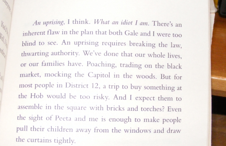
The latter typeface appears to be Bembo, which I like quite a bit for its readability and in which I am leaning towards typesetting The Reintegrators.
Divergent is a pretty long book, over 486 pages in this printing, and that’s with a small font (I believe it’s set in 12 point, but as previously mentioned the glyphs and kerning are fairly dense). Catching Fire is only 472 pages in 12 point Bembo, and The Reintegrators laid out with the same settings is around 405. There is one odd thing I noticed about the Divergent layout, however–the bottom margin is about one line larger than it needs to be:

This is a neat trick for artificially expanding a book’s page count, but I find it a bit aesthetically displeasing, so I think I’ll keep the standard 3/4″ margins all around. After all, what’s the point of self-publishing if I don’t do things the way I want to do them?
With the preparatory work out of the way, it’s time to move on to the actual technical details of getting the book made. When publishing on Createspace (not the only option to be sure, but the one I’m going with because a. people generally seem to like them b. I didn’t like the only other print publisher I’ve tried, Lulu c. Amazon integration, duh), all you really need to hand over is a PDF of what the pages of your book will look like–how exactly that PDF gets made is entirely up to you. Of the available processes, however, it became clear quickly that the easiest and best one was going to be using Microsoft Word to do the layout. Createspace will get you started with this by providing handy MS Word templates in a variety of sizes. All you have to do is download, paste your text in, export to PDF, and boom, bestseller baby.
Well, not quite–there’s still the matter of getting the book to look the way you want. Obviously, already being familiar with Word will be a big help here. Createspace sets you up with a (mirrored) 0.13″ gutter which you will most likely not want to mess with, but aside from that you’re free to change the margins to your liking. Heading and body fonts will need to be chosen, and page numbers laid out the way you like (bottom center and bottom corner seem to be popular choices). I’ve also noticed a tendency among books on my shelf to use sans-serif fonts for page numbers and chapter headings, as opposed to the mandatory serif for the text itself.
During this whole process, I was thankful for a habit I picked up when formatting Epic Fantasy 0.9b using the Smashwords Style Guide: always format text using Word’s built-in style functionality, never by highlighting and formatting ad-hoc. What this means in a nutshell is that if you want some text to look a certain way in Word, you should never be selecting it, then changing the font, paragraph style, et. al. Rather, create a new style (those boxes in the Home menu labeled Normal, Heading 1, etc.), set your preferences there, then click in the text in question and select the style you want. If you’re diligent with this, it means you can quickly flip around the font for your body text or other elements and see how a typeface looks across the entire document, how it affects the page count, etc. Really handy.
Once the book is laid out to your liking, the last step is to save it as a PDF. This is where I hit a bit of a snag: many of the fonts I was working with come in OpenType format, and it turns out that when you save a file as a PDF in Word which uses such a font, the result (when zoomed in) looks all jaggy:
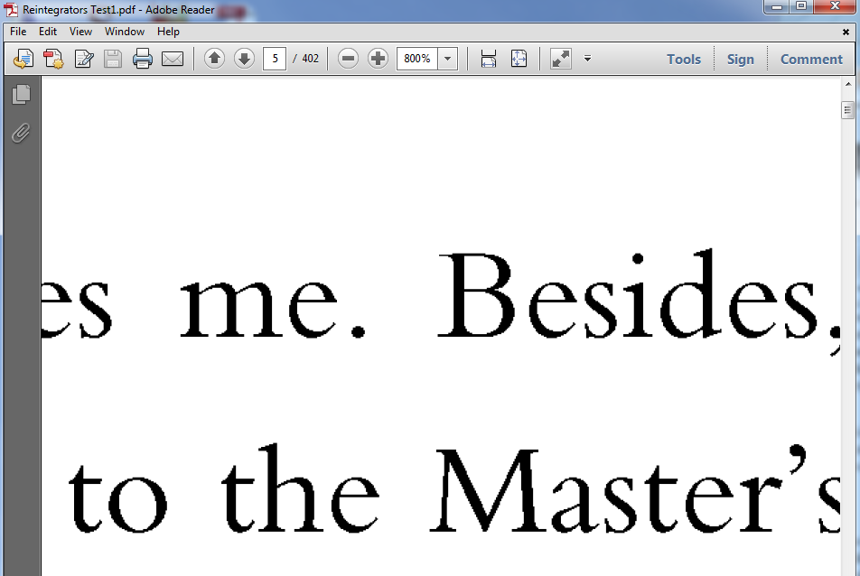
Now, I have no idea how this “issue” would affect the actual printed book, but my gut tells me it probably wouldn’t do any good. However, thanks to a helpful forum post, I found a solution: PDF995. This shareware creates a printer on your system which saves files as PDFs, and (unlike Word) it supports embedding OpenType fonts. So, after jumping through a bit of a hoop to get the paper size correct, I printed my document to the PDF995 printer, and just like that, no jaggies:

Now that I’m satisfied that I can produce a PDF to my liking, it’s time to move on to proofreading and finalizing the cover. Oh, and actually wrestling with Createspace to get the book to look the way it’s supposed to. I’ve heard some bad stories about that…
1. Sort of; they’re both YA sci-fi adventures, but my book isn’t in the “post-apocalyptic adventure with strong female lead in first-person present tense” sub-genre that seems to be so popular these days.

Thank you – I love posts like this, which take people through step by step. I’ve heard also that scrivener can be a great piece of software to use for formatting in terms of kindle-ready text; I think it also has the ability to do formatting for POD. Or at least that’s what I’ve been told.
Thanks, Deborah. I tried the 30 day Scrivener trial and while I see why people like it, in the end I had to go back to my old familiar Word. Just a comfort thing, I guess.